Gabor Maté
What we did
- Strategic insight and brand positioning
- Brand creation and tone of voice
- Visual identity system and style guide
Creating a presence aligned with the integrity of the work
We are living through a global perma-crisis. As everyday life becomes more destabilising, more people are recognising the impact of trauma in their own lives and seeking understanding, not just ways to cope, but deeper insight into why they feel the way they do.
Gabor Maté’s work has shaped the global trauma conversation for decades. His books are international bestsellers, his talks fill auditoriums, and his thinking has profoundly influenced how trauma is understood across medicine, psychology, and culture. At the heart of his work sits a clear conviction: much of human suffering is rooted in trauma, and the society we live in is not structured to support true wellbeing.
Gabor is highly intentional about how his work is presented in the world. Visibility must serve the integrity of the message rather than distract from it. The challenge was not to amplify or repackage his thinking, but to create a presence that felt human, grounded, and aligned, allowing the work to be encountered without compromise.
We were brought in to shape a digital and visual environment that reflected this ethos, beginning with his website and extending across key touchpoints.
Insight, held with compassion
This became the guiding principle for the work.
Gabor’s voice is shaped by decades of clinical practice, lived experience, and close observation of human suffering. His authority does not come from abstraction or theory alone, but from his ability to articulate complex patterns of trauma in ways that feel deeply human and immediately recognisable.
Compassion is not an addition to his work. It is the medium through which insight is offered. Without it, the work would lose its humanity; without depth of insight, it would lose its weight. The power of Gabor’s contribution lies in his ability to hold both simultaneously.
Our task was to ensure this quality translated clearly across visual and verbal touchpoints, allowing people to encounter the work in a way that felt grounded, accessible, and true to its origins.
Building from what was already essential: The signature as a mark of authorship
Gabor’s presence in person is widely recognised for its warmth, depth, and clarity. Translating that quality into a digital environment required restraint rather than amplification.
Placing his signature at the centre of the identity created a personal, human mark — closer to authorship than branding. The GM initials act as a quiet signal that what you are engaging with has been shaped and endorsed by him.
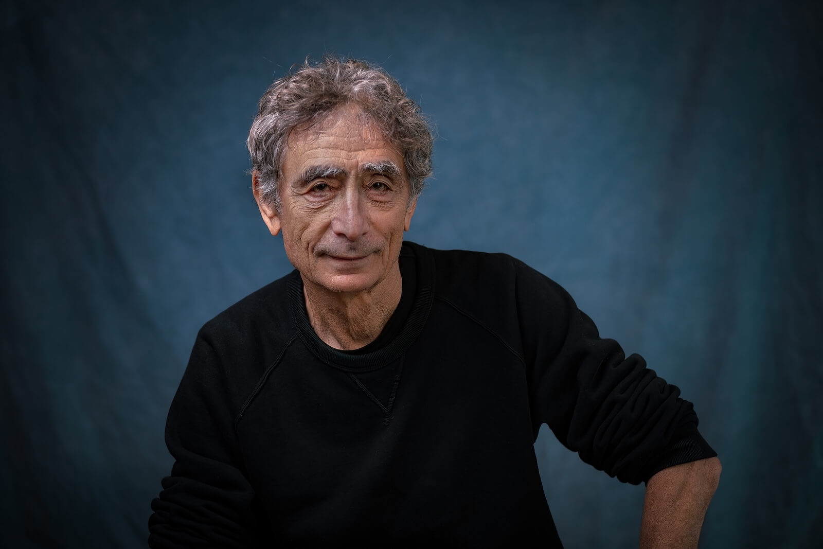
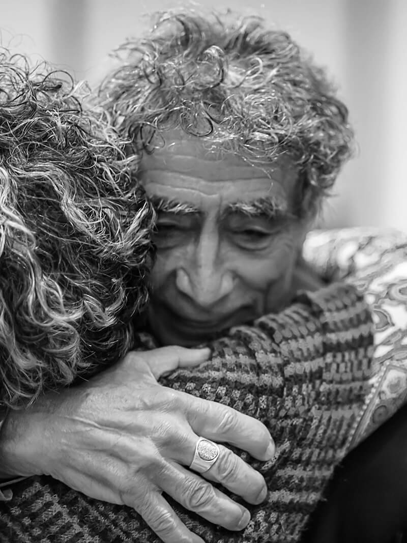
Portrait photography was approached with the same intention. Intimate, considered imagery allows his humanity to come through without performance. Rich, warm tones sit alongside stark black and white imagery, depending on context. Together, they bring a sense of presence and gravity to every touchpoint.
A clearer way of showing up
The result is not a louder presence, but a more coherent one. Gabor and his team now have a visual and verbal language that supports the work across digital platforms, communications, and public-facing moments — without drawing attention away from the substance of what is being shared.
Reflecting on the work, Gabor shared:
“It, once again, is perfect. I love the branding.”